Lesson 5: The Professional Application of Color
Several factors influence how color is perceived in a floral design.
1. Dominance
How to proportion color in a floral composition is always a question, especially for beginning designers. Usually one color is (in a design with two or more colors) occupying the most space in a floral design. In other words, it is dominant. The second color is often used as an accent. When many colors are used in the same composition in equal quantities, the composition appears random and mixed.
Practical Application:
When someone's favorite color is used predominantly in a composition, it is pleasing to them. They feel it expresses their personality.
2. Discord
Discordant colors or clashing colors, used intentionally, can manipulate the emotions. Wrong use of color (disharmony) creates a troubled, restless mind. They exaggerate the subject and surprise the eye. The standard guidelines for harmony are not relevant. Any color used in a way not traditionally expected challenges our ideas and expectations.
Practical Application:
New Wave style designs, with their often paint-altered materials, employ shock value which challenges most viewer's expectations. Some people love this type design for its flamboyant style. Others despise it. New Wave style designs always produce a strong reaction from the viewer.
 3. Harmony
Harmony is expressed by the logical application of color. When colors are harmonious, there is an obvious connection between the mind and subject, the subject and picture and the color and the color symbolism. Anything the viewer can understand easily and which appears natural (based on experience) feels pleasant. For most designers, the purpose of using color is to make life more pleasant, more beautiful and more enjoyable. This is best created by using color harmoniously.
Practical Application:
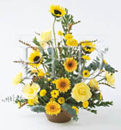
Yellow. It's several tints, tones and shades combine here to create harmony. There is no question when you look at this design that it is planned and works together. The textures are different providing contrast, but the color brings all of the elements together in a harmonious blending of different elements.
 4. Texture
Colors can be greatly influenced by a material's texture. The ability of the surface to absorb or reflect light rays will change how a color is perceived. Shiny surfaces intensify color; rough woven surfaces deepen color. Matte or flat finish surfaces absorb light and appear darker than light reflecting glossy surfaces.
Practical Application:
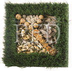
Green permanent grass makes this square box rather unique. Textural elements are repeated within the box's confines. Immature cones, folius, spruce bark, reindeer moss provide a myriad of surfaces for the hand or eye to experience. Each surface reflects light (and therefore color) differently to create interest.
 5. Balance
The eye searches unconsciously for balance in every environment. Dark objects appear heavier in weight than same size items which have a light color value. Since visual balance is such an important ingredient in most floral compositions, the placement of darker objects at the base of a design is essential to creating an instant balance. Light value materials are usually used in a design's perimeter.
Practical Application:
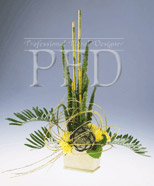
The design is an example of symmetrical balance. Although it might not be the expected triangular form, it has the even distribution of materials on each side of the central axis (the imaginary center line). Cane establishes the height in the center. Cycas palm moves to each side, while an artichoke provides a strong focal point in the center. Yellow carnations add visual weight and texture at the base. Randomly placed willow whips enclose the center of the design, adding line movement.
6. Lighting
The amount of available light in a room or location greatly effects how colors are perceived. When a location is well lit, colors appear at their full value and have impact. In darker places, colors are muted and often disappear (especially flowers with deep color values).
Practical Application:
Flowers used on an altar in a place of worship are often "absorbed" by the lack of bright light. Dark blue, purple and burgundy flowers should be avoided when light levels are low. Instead select flowers that have lighter (or advancing) colors for maximum visual impact.